[分享]炫酷登录页大变身Web动效设计
2024-08-18 17:09:55
0
159
你还在用普通的登录页面吗?快来看看如何用简单的HTML、CSS和JavaScript,打造一个让用户眼前一亮的动效登录页!本文带你step by step实现霓虹按钮、粒子背景等酷炫特效,让你的网站瞬间高大上!
🌟 亮点速览:
动态粒子背景:让页面"活"起来
毛玻璃效果:提升视觉层次感
智能输入框:增强用户交互体验
霓虹按钮:吸睛利器,提高点击率
响应式设计:手机电脑完美适配
💡 无需复杂框架,纯原生代码实现 🔧 新手友好,附带详细注释和讲解 🚀 立即提升你的前端开发技能!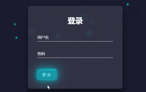
完整代码:
@import url('https://fonts.googleapis.com/css2?family=Poppins:wght@300;***;500;600&display=swap');

        *, *::before, *::after {
            box-sizing: border-box;
            margin: 0;
            padding: 0;
        }

        body {
            font-family: 'Poppins', sans-serif;
            background: #1a1a2e;
            color: #ffffff;
            overflow: hidden;
        }

        .container {
            display: flex;
            justify-content: center;
            align-items: center;
            height: 100vh;
        }

        .login-box {
            background: rgba(255, 255, 255, 0.1);
            border-radius: 10px;
            padding: 40px;
            backdrop-filter: blur(10px);
            box-shadow: 0 15px 25px rgba(0,0,0,0.6);
            width: ***px;
            max-width: 90%;
        }

        h2 {
            margin-bottom: 30px;
            text-align: center;
            font-size: 2em;
        }

        .input-box {
            position: relative;
            margin-bottom: 30px;
        }

        .input-box input {
            width: 100%;
            padding: 10px 0;
            font-size: 16px;
            color: #fff;
            border: none;
            border-bottom: 1px solid #fff;
            outline: none;
            background: transparent;
            transition: 0.5s;
        }

        .input-box label {
            position: absolute;
            top: 0;
            left: 0;
            padding: 10px 0;
            font-size: 16px;
            color: #fff;
            pointer-events: none;
            transition: 0.5s;
        }

        .input-box input:focus ~ label,
        .input-box input:valid ~ label {
            top: -20px;
            left: 0;
            color: #03e9f4;
            font-size: 12px;
        }

        .btn {
            position: relative;
            display: inline-block;
            padding: 10px 20px;
            color: #03e9f4;
            font-size: 16px;
            text-decoration: none;
            text-transform: uppercase;
            overflow: hidden;
            transition: 0.5s;
            margin-top: 20px;
            letter-spacing: 4px;
            background: transparent;
            border: none;
            cursor: pointer;
        }

        .btn:hover {
            background: #03e9f4;
            color: #fff;
            border-radius: 5px;
            box-shadow: 0 0 5px #03e9f4,
                        0 0 25px #03e9f4,
                        0 0 50px #03e9f4,
                        0 0 100px #03e9f4;
        }

        .btn span {
            position: absolute;
            display: block;
        }

        .btn span:nth-child(1) {
            top: 0;
            left: -100%;
            width: 100%;
            height: 2px;
            background: linear-gradient(90deg, transparent, #03e9f4);
            animation: btn-anim1 1s linear infinite;
        }

        @keyframes btn-anim1 {
            0% {
                left: -100%;
            }
            50%,100% {
                left: 100%;
            }
        }

        .btn span:nth-child(2) {
            top: -100%;
            right: 0;
            width: 2px;
            height: 100%;
            background: linear-gradient(180deg, transparent, #03e9f4);
            animation: btn-anim2 1s linear infinite;
            animation-delay: .25s
        }

        @keyframes btn-anim2 {
            0% {
                top: -100%;
            }
            50%,100% {
                top: 100%;
            }
        }

        .btn span:nth-child(3) {
            bottom: 0;
            right: -100%;
            width: 100%;
            height: 2px;
            background: linear-gradient(270deg, transparent, #03e9f4);
            animation: btn-anim3 1s linear infinite;
            animation-delay: .5s
        }

        @keyframes btn-anim3 {
            0% {
                right: -100%;
            }
            50%,100% {
                right: 100%;
            }
        }

        .btn span:nth-child(4) {
            bottom: -100%;
            left: 0;
            width: 2px;
            height: 100%;
            background: linear-gradient(360deg, transparent, #03e9f4);
            animation: btn-anim4 1s linear infinite;
            animation-delay: .75s
        }

        @keyframes btn-anim4 {
            0% {
                bottom: -100%;
            }
            50%,100% {
                bottom: 100%;
            }
        }

        .particles {
            position: absolute;
            top: 0;
            left: 0;
            width: 100%;
            height: 100%;
            overflow: hidden;
        }

        .particle {
            position: absolute;
            display: block;
            pointer-events: none;
            width: 5px;
            height: 5px;
            background-color: #03e9f4;
            box-shadow: 0 0 10px #03e9f4;
            border-radius: 50%;
            animation: particles 15s infinite linear;
        }

        @keyframes particles {
            0% {
                transform: translateY(0) rotate(0deg);
                opacity: 1;
                border-radius: 0;
            }
            100% {
                transform: translateY(-1000px) rotate(720deg);
                opacity: 0;
                border-radius: 50%;
            }
        }
<div class="particles"></div>
    <div class="container">
        <div class="login-box">
            <h2>登录</h2>
            <form>
                <div class="input-box">
                    <input type="text" required>
                    <label>用户名</label>
                </div>
                <div class="input-box">
                    <input type="password" required>
                    <label>密码</label>
                </div>
                <button type="submit" class="btn">
                    <span></span>
                    <span></span>
                    <span></span>
                    <span></span>
                    登录
                </button>
            </form>
        </div>
    </div>
<script>
        document.addEventListener('DOMContentLoaded', (event) => {
            createParticles();
        });

        function createParticles() {
            const particlesContainer = document.querySelector('.particles');
            const particleCount = 50;

            for (let i = 0; i < particleCount; i++) {
                let particle = document.createElement('span');
                particle.classList.add('particle');
                let x = Math.random() * window.innerWidth;
                let y = Math.random() * window.innerHeight;
                let size = Math.random() * 5 + 2;
                particle.style.left = x + 'px';
                particle.style.top = y + 'px';
                particle.style.width = size + 'px';
                particle.style.height = size + 'px';
                particle.style.animationDelay = Math.random() * 15 + 's';
                particlesContainer.appendChild(particle);
            }
        }

        window.addEventListener('resize', () => {
            const particles = document.querySelectorAll('.particle');
            particles.forEach(particle => particle.remove());
            createParticles();
        });
    </script>
天启
65 天前
签名 : 大运河向南是我家
159
0
免责声明 : 用户发表言论,签名内容均为会员个人观点,并不代表花趣站长网立场!
评论
登录 | 注册
最新帖子